Branding to be proud of!
Share
For those of you that have been following along with me for some time now will know that I am now officially full time with my Ceramic's business.
Strangely enough, I had been speaking with a Graphic Designer that I had been wanting to work with for some time in the month or two leading up to my redundancy, without knowing at this point that was looming in my future. My rebrand was complete the same week I officially became redundant/full-time and it all felt very aligned. (thank you universe!)
I was so thrilled to work with Hannah Valentine on my rebrand. I had never worked with a Graphic Designer before and had spent the 3 years prior designing my own branding with help from my partner. Whilst it worked for those first 3 years, I felt like I was getting to a point where my brand values were feeling clear and certain but my branding wasn't reflecting it. After a zoom with Hannah, we ran through some questions to help her get an idea of what I am after (although I pretty much had no idea!) and Hannah went away and did her wonderful thing. I was sent a first draft through and I was honestly besotted and blown away with her work, we barely made any changes.
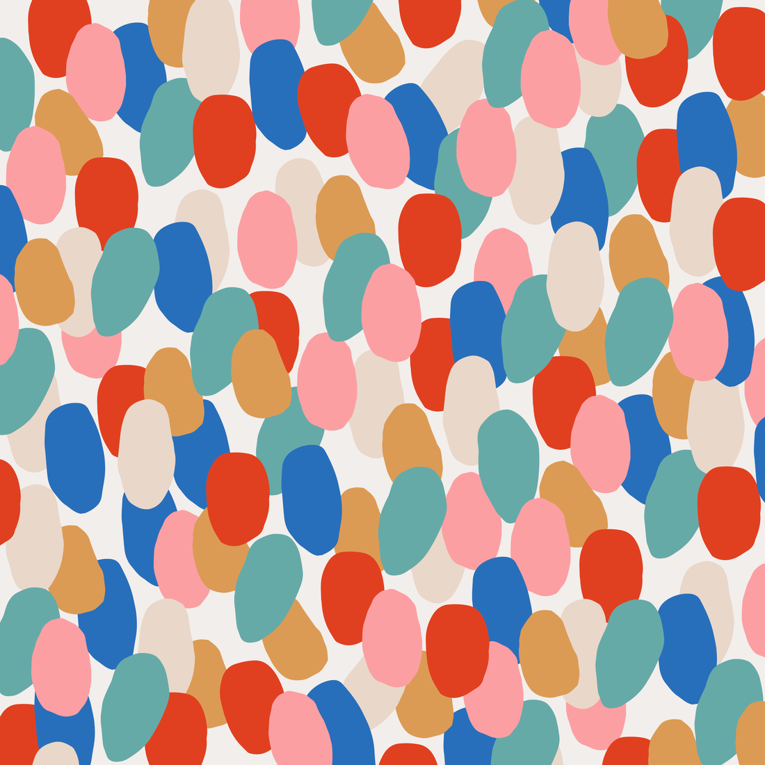
We worked with the words: colourful, statement, playful, fun, expressive.

It's no secret that I love to use colour in my work. I am on a mission to create ceramic jewellery and homewares that help people express themselves and to help people feel empowered, and colour is something I focus on to achieve that. I am also a HUGE lover of speckled glazes, especially the colourful ones! Speckled glazes are very special to me as mostly their results cannot be determined, unless you were to manually place each crystal and speckle yourself. But I love leaving the application up to fate. This way, each piece has that extra element of individuality as the pattern of speckle can rarely make the exact same result twice!
So, as I discussed this with Hannah, she decided this was something we can incorporate into the branding. She even ventured onto my website and drew inspiration from specific glazes that I use in my work (a very good egg indeed).

Within my rebrand I had graphics for my website, business cards, thank you notes, stickers and some individual shapes taken from my printables that I can use online as and where I see fit. My stickers, business cards and thank you notes are included in each online order and sale at a market. My thank you notes are probably my favourite; whilst they are simple and have enough negative space to play with, the shapes and subtle use of the speckle in the text "Thank You" just have such a wonderful feel to them. These cards explain a little bit about my business and my events and offer the customer a 10% discount on their next shop! ☺️
It's through this entire experience that I have realised the worth of having branding to be proud of. It adds an extra level of confidence to you as a business owner, installs trust for the customer and just looks so damn PRETTY!
Big thanks to Hannah Valentine for all the beautiful work, who you can find here:
@hanvalentine_
